Showing posts sorted by relevance for query primer paint. Sort by date Show all posts

Monday, 26 March 2012

Mark Smith's Otaki Ki-44 and Anthrazitgrau


Here are a couple more images of the 1/48th scale Otaki Ki-44 built by Mark Smith and mentioned in the review of Lifelike Decals Shoki sets here. The amazing thing about this lovely model is that all the markings are painted on as at the time it was built there were no aftermarket decals available. Mark still really likes the Otaki Ki-44 for capturing the lines of the Ki-44.  He remembers comparing it with the Hasegawa kit when that one came out and concluding that whilst the Hasegawa kit is better overall, certain shape aspects are still better captured in the older kit - the fin and rudder for example. The model has a vacform canopy and scratch-built cockpit, new cowl flaps and some extra detail added to the landing gear and engine.  The natural metal finish is SNJ which Mark recalls as being a lot of trouble and smelling really dangerous!  The 246th's 'umeboshi' (梅干 dried plum) tail emblem was made with a stencil and airbrush, whilst the landing gear doors were painted with a brush. The model was built before anyone offered resin parts for it, and as Mark recalls the only etched metal that was available at that time and pertinent to WWII planes were Waldron seatbelts (applied to the model) and placards.  


Some puzzlement over my description of the greyish-black paint on Lt Inayama's Shoki as 'anthracite'. I meant it in the sense of the German anthrazitgrau which was a military primer paint that came into use around 1935 and was also used by the Luftwaffe as 4/840/R Fliegerblaugrau (RAL 7016). Blue-grey? Yes, a very dark blue-grey where the blue can be fugitive as it is introduced to the reflectivity from the blue shade carbon black pigment in the paint. Counter-intuitively the paint also contains chrome yellow which provides a degree of anti-corrosive protection and the combination results in a subtle colour shift of the greyish-black, dependent upon illuminant, from slightly blueish to slightly greenish, exactly similar to the JAAF # 3 paint colour Hairanshoku or Hai-Ai-iro (灰藍色 literally ash indigo colour), which was introduced as a primer paint and cockpit interior paint colour in 1936. The Munsell value for RAL 7016 is 7.7 B 3.0/0.8 but there is a usefully close FS 595B value - 35042 @ 0.82 (where < 2.0 = a close match) which also provides a reasonable impression of the colour. If you examine 35042 and find it hard to imagine that such a very dark blue grey contains chrome yellow bear in mind that the FS 35042 paint colour also contains that pigment, as well as phthalocyanine blue (green shade). As a general primer paint # 3 was widely used and might well have provided the greyish-black paint that was applied to Lt Inayama's Shoki.     


Image credits: Model photos © 2012 Mark Smith; Rendered colour chip © 2012 'Straggler'

Friday, 14 April 2017

Vallejo IJN Colors Set ~ A Visual Appraisal & Commentary


Following on from the appraisal of the Acrylicos Vallejo, S.L. IJA paint colours set, Art.71169 is a set of 8 paints for 'Imperial Japanese Navy (IJN) Colours Pre-War to 1945' consisting of the following colours:-
  1. IJN Dark Black Green AV71325
  2. IJN Black Green AV71322
  3. IJN Deep Dark Green AV71310
  4. IJN Ash Grey AV71311
  5. IJN Medium Grey AV71312 
  6. IJN Medium Brown AV71418
  7. AOTAKE Translucent Blue AV71419
  8. Aluminium AV71062
These are also in plastic 'eye-dropper' bottles in an attractive carton featuring a colour photograph of an A6M5 Zero in flight over chips of each paint colour which are fairly close to their actual appearance, a guide with profiles (shown below) and a brief explanation of the usage of each colour with FS 595 equivalents. Inside the box is a folded leaflet showing the Vallejo paint range.


Again the Vallejo colour descriptions do not fully correspond to IJN paint colour designations. This makes it more difficult to reconcile them without direct comparisons and tends to perpetuate the imprecise understanding of the colours fostered by previous hobby paint ranges. A commentary on each paint colour follows. 

IJN Dark Black Green AV71325 - this is described as a one coat upper surface colour as applied by Mitsubishi over ash grey/medium grey or natural metal and compared to FS 34052. It is approximately similar to D1 Deep Black Green but lacks blue-green chroma and is more greyish.

IJN Black Green AV71322 - this is described as representing the upper surface paint of Nakajima-built Zeros and "all kinds of aircraft of other manufacturers", being compared to FS 34077. It is greener than the FS value but duller than D2 Black Green, lacking the blue-green undertone of the original colour. 

IJN Deep Dark Green AV71310 - on the way into green garden shed territory with this one which is described as the upper surface paint applied by Kawanishi and Aichi, being compared to FS 34058. That FS value is the closest to Thorpe's N2 Dark Green but not that close @ 3.99 (where < 2.0 = a close match), being more vibrant and blueish. The difference is shown below.


The two Vallejo Black Greens seem more typical of weathered and aged paint, described the wrong way round, with the colour attributed to Mitsubishi rather more typical of Nakajima and vice versa, although sources do differ on those assertions. The subject is explored in more detail in the AoJ  IJN Greens PDF. The Vallejo colours dry matt which adds to this perception, but they do become slightly richer in appearance with a gloss coat.  The Deep Dark Green is dodgy for reasons beyond the scope of this blog feature but Kawanishi Shiden and Shiden-kai colours were explored here in February and May, 2010, including interiors, but the subject is by no means as straightforward as any confidence in hobby paint sets might suggest! A Shiden colours PDF is scheduled for the AoJ Key Data colour series.

IJN Ash Grey AV71311 - described as the colour for "most embarked aircraft" and in use until 1942/43 it is compared to FS 36350, therefore close to the Mitsubishi Zero early factory colour, albeit just a little darker and browner than the FS value. It lacks the olive undertone of the original paint.

IJN Medium Grey AV71312 - this is compared to FS 36375 and described as used for lower and fabric surfaces. The actual paint is nothing like the FS value which is a slightly violet tinged light blue-grey but is a warmer, more neutral grey closer to FS 36357, so I suspect a typo or something lost in translation here.

IJN Medium Brown AV71418 - this colour is compared to FS 30122 and is similar to many depictions of the pre-war brown applied as camouflage together with dark green to the upper surfaces of IJN aircraft, particularly in the China theatre, but surviving into the Pacific War on types such as the G4M and some floatplanes. The precise hue of this brown is still a matter of conjecture and Japanese researchers have attributed it as H2 more by deduction than proof. The Vallejo paint is a medium to dark reddish brown but not as dark as the prop colour or as reddish as the primer paint.

AOTAKE Translucent Blue AV71419 - more typically blueish-green than the aotake paint included in the IJA set but still more towards green than blue. Although not compared to a FS value, it is similar to Thorpe's N17 Translucent Green.

Aluminium AV71062 - this is the same colour included in the IJA set.

 Vallejo IJA paint colours shown by their cited FS equivalents ~ the actual paint colours vary slightly 

Again something of a mixed bag. The two Black Greens both lack blue-green chroma and tend towards olive greens, which some might prefer but which are more representative of weathered and aged paints. The greys are uncontroversial unless you still believe in 'white' Zeros, but the so-called Ash Grey lacks the distinctive olive undertone of the original paint and the Medium Grey is closer to FS 36357 than FS 36307 which is associated with J3, 2-6 and the fabric dope. The Medium Brown is a catch all and will probably look good with Dark Green on the pre-war types whilst the aotake is more representative than that included in the IJA set. Colours aside, useability appears a matter of preference with some concerns expressed, but seemed to be of more interest than the colours themselves judging by the comments about the IJA set (!). This set was also purchased from Everything Airbrush (The Spraygun Company Ltd) in Poole, Dorset and is the same price as the IJA set.

Image credit: All © 2017 Acrylicos Vallejo, S.L.


Saturday, 29 August 2009

Useful Colours ~ Army Interiors Part One


"A little learning is a dangerous thing" said Alexander Pope. Well in modelling terms it is probably not dangerous - perhaps just misleading and rather irritating. Perhaps for modelling purposes Amos Bronson Alcott is more succinct: "To be ignorant of one's ignorance is the malady of the ignorant". Mr Alcott's observation is vindicated online on an almost daily basis and it often seems that those most afflicted with the malady are the most persistent imparters of opinion and information.

One of the most prevalent outcomes of "a little learning" is the dissemination of information in diluted or misunderstand forms which then become modelling conventions. There really does need to be a distinction drawn between the freedom to paint one's model whatever one likes and the sometimes unstated implication that the choice represents an outcome of research intended to impart "a little learning" to others. By such dubious means we have a generalised belief (reinforced by hobby paint companies) of aotake as a metallic blue-green paint applied in all Japanese aircraft cockpits and Luftwaffe sandgelb used by Kawasaki to paint the interiors of all their aircraft.

In Army form 'aotake' was introduced as a translucent dark blue primer for the interior of aircraft by the Army aircraft painting regulations of 3rd March 1932 (that is the Army painting regulations - once more - the Army painting regulations). It was not metallic per se but the application of the clear blue to bare metal surfaces no doubt gave (and gives) that impression. On 5th February 1936 the regulations were revised and the use of aotake (青竹色 - literally blue green bamboo colour - or sometimes written as 淡青色透明 - literally thin, translucent, light blue colour) was replaced by a dark greyish blue opaque primer paint which became colour standard #3 Hairanshoku or Hai-Ai-iro (灰藍色 literally ash indigo colour e.g. a greyish blue) in the Army colour standards. In practice this new paint was usually applied to internal crew areas whilst 'aotake' continued to be applied to other internal areas. Was #13 Ao iro ( 青色 - blue colour) also applied to some cockpits, either in error or expediency? Maybe.

There are two clues to the appearance of this colour standard. Firstly the actual Hess-Ives values used to measure the authorised range of hue in the procurement of Army paint supplies and secondly a pre-war French colour card which illustrates the colour and explains its use. Was there a connection between the French bleu nuit (night blue) interior colour and the Japanese interior colour? Perhaps. There is also another thing to bear in mind which is the distinction to be drawn between the colour standard and the actual paint supplied and applied. The two are not invariably the same. The promulgated colour standard displayed a variable and authorised range against which the paint suppliers (or more usually aircraft manufacturers) attempted to match. This distinction does seem to be misunderstood or perhaps under-appreciated.

In Methuen terms the median standard colour is a dark greyish blue between 23 E-F 5. The closest standard Munsell notations are between 2.5 PB 3/2 @ 2.98 and 2.5 PB 3/4 @ 2.40. The closest FS 595b value is 25053 @ 3.61 (but too blue), but 26118/36118 @ 7.02 (too grey) is often cited and indeed may provide a better scale impression although it is not quite blue enough. (A comparison value of 2.0 or less equals a close match). Ken Glass kindly advises that a reasonable out of the bottle match is Pollyscale RLM 24 Blau but it may need to be lightened with white and/or toned down with grey to match the swatches. 

The survival of badly weathered remnants of this paint in cockpits can give rise to a misidentification as aotake, but in practice diluted #3 spray or brush applied is not dissimilar in appearance. Aircraft interiors known to have been painted to #3 standard are Type 91, Ki-27, Ki-21, Ki-36, Ki-43, Ki-44 and Ki-48. Ichiro Hasegawa described the interior of a Ki-55 ('Ida') as having been painted in two colours, one being the bluish grey and the other a yellowish grey-green (the latter colur will be examined in Part 2). He also described the interior of both the Ki-21 ('Sally') and Ki-27 ('Nate') as being painted in this bluish grey which created a "gloomy impression", even the gunners mats being painted the same colour.The use of this colour continued until the introduction of new requirements on 15th June 1943 - of which more anon.

One of the aspects of the study of Japanese aircraft that continues to surprise me is the inability or perhaps unwillingness of some to reconcile the known (and published) Army colour standards with the extant appearance of paint on artifacts. It sometimes seems as though an element of being in denial exists, as though somehow the Army colour standards are not real and an opinion about a 65 year old fragment of paint without antecedence or provenance is more reliable. Hopefully one day we shall be able to move on from a quasi-religious veneration of the paint fragments to a broader and more equivocal appreciation of all the evidence.

Once this mini-series on interior colours is complete I intend to make it available as a pdf with appropriate hobby paint mixes which we are working on.

Image credits:- Ki-21 crew © 1942 Front Magazine; Colour chips © 2009 Straggler


Thursday, 28 October 2010

On Accuracy, Purple Rufes and The Real Colours of Zero B11-124 s/n 5349

A couple of threads on other forums have given me pause for thought on the subject of accuracy in modelling. Of course that concept is a stretchable piece of elastic which can look very different depending upon which particular angle you approach it from. I suppose that modelling in the main consists of both imitative and interpretative strands, the former being concerned with verifiable fact and the latter with speculation. Of course the line is blurred and interpretation itself covers not just informed conclusion but half-truths and also wilder, more adventurous forays. If you come at the "elastic" from one particular angle there is a tendency to frown at those who might approach it from others. But it is all a moving feast.

The subject of Japanese model aircraft accuracy is beset by a multitude of unknowns, but almost uniquely this air of genuine mystery appears to have obscured much of the verifiable fact too. I'm not sure why this is. I can't imagine seeing a thread pertaining to the Bf 109 develop in the way of that thread concerned with an aotake-primed Zero model. On the one hand a desire for knowledge was eventually professed but on the other hand, when it was given, the provider had been roundly condemned for spoiling the fun. Apparently it was all about the manner of delivery. When you criticise the accuracy of a model you must do so courteously and politely - or you'll be subject to a vehemently rude gang attack! And all that talk of "the usual suspects" had me smiling; "The creatures outside looked from pig to man, and from man to pig, and from pig to man again; but already it was impossible to say which was which." 

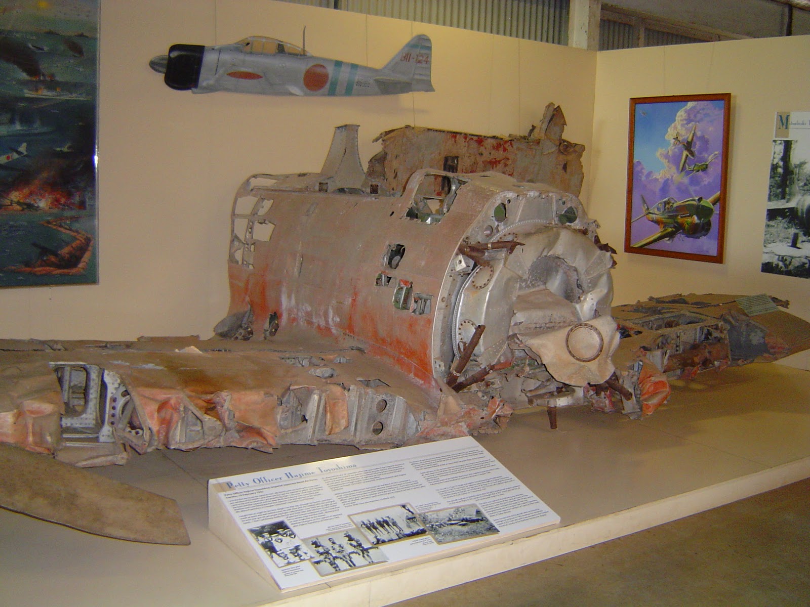
The model above depicts the mortal remains of Mitsubishi A6M2 Zero BII-124 s/n 5349 as it sat derelict on Melville Island in the 1970's. This Zero, from the carrier Hiryu and piloted by Hajimi Toyoshima, was shot down during a raid on Darwin on 19 February 1942, crash landing on Melville Island. The model was made by Owen Veal and the image kindly provided by Bob Alford in response to earlier "Purple Rufe" musings. Owen made the model in balsa then first primed it with a colour match to the red primer used on the real aircraft. A top coat was then applied, matched to the weathered grey of the aircraft finish at that time, then the whole was deliberately abraded to represent the aircraft exactly as it then appeared - weathered after some 30 years in the harsh environment of tropical sun and two seasons - wet and dry. Remind you of anything?

And above is the actual aircraft as it appeared on display in the Australian Aviation Heritage Centre in 2009.

Zero B11-124 on Melville Island in 1942


Contemporaneous intelligence reports describe this Zero as follows:-
  1. "Markings on rudder BI-124 (sic). Number on fuselage 5349. Aircraft finished grey, with red circles on mainplanes and fuselage. Two blue bands encircling fuselage at rear of red circle" (Sgt W A Beatty Fitter IIE 13 Sqn RAAF 7 March 1942)
  2. "From visual observation today, the opinion has been formed by the IO (Intelligence Officer) that the wreckage is not recent, it presented a somewhat bleached appearance, but in contradiction the red roundels . . . (do) not appear to have faded." (PO J A Evans IO 52 OBU Darwin - observation made from a B-25 of 18 NEI Sqn circra March 1943)
  3. "The remains of the Zeke were in remarkably good condition. Very little rust was observed. The anti-corrosive paint used is evidently very effective, wing tips showing red roundels were found. The red paint of the roundel was still very bright. A piece of the red roundel was brought back to show colour. . . the wings and body were silver grey in colour." (FO C D Pender IO 15 Fighter Sector 28 April 1943)


Zero B11-124 on Melville Island in 1942

Sample of paint surface from Zero B11-124 s/n 5349

Various samples of paint from s/n 5349 were examined and analysed. The paint surface which had oxidised and "chalked" was found to be similar in appearance to the Tamiya paint XF-76. However when buffed back to remove the oxidisation and chalking the paint surface was revealed to be glossy, darker and a different hue. The measured colour value of this surface was found to be almost exactly between Munsell 5 Y 5/2 and 5 Y 6/2 or very close to FS 595B value 16350 @ 1.51 (where a difference calculation of 2.0 or less = a close match) and to RAL 7034 Gelbgrau (Yellow Grey) @ 1.64. Further analysis suggested that as a result of thermal ageing this paint surface was probably slightly darker and yellower (browner) than the original had been. In other words the original paint was slightly lighter and greyer - with the emphasis on slightly. The "greenish" appearance of the paint is largely illusionary and the result of an interaction between two of the constituent pigments. The paint colour is also highly metamerismic, its appearance to the human eye significantly shifting under different forms of illumination.

Schematic of compared paint colour values

Rather surprisingly the remnants of Aotake extant on the reverse side of these pieces was found to be a brilliant, almost emerald, green rather than blue-green or blue, with an evident "metallic" appearance (see below).

Comparison of extant paint surface to Tamiya XF-76 (showing Aotake)

So, there are two verifiable facts here. The current appearance of the oxidised/chalked paint surface and the current appearance of the buffed back paint surface. To take this further involves making presumptions and/or conclusions drawn from experimental analysis. In order to believe that the buffed back paint surface accurately reveals the original paint colour we have to presume that:-

a) The concealed/protected surface colour has not shifted in colour; and

b) That the buffing back process has revealed the original surface appearance and not something else.

If we are to believe instead that the oxidised and chalked paint surface reveals the colour of the original paint then we must presume that the paint surface has not oxidised or chalked! In reality both positions are tenuous and almost impossible to insist on without further analysis, especially remotely where the dependency is on imagery rather than physical handling. Even after further analysis any conclusions that are drawn must depend on the perceived validity of that analysis. Those who have a strongly pre-determined opinion will not be swayed by any evidence, always finding reasons to question, challenge or disbelieve it. This response is also related to the approach where evidence is selected or presented in order to support a pre-determined, wished-for outcome. Unfortunately both are prevalent, especially in the world of modelling.

In fact the paint is on a journey the moment it leaves the tin and changes will depend not just on external factors, active and passive, but also on the inherent characteristics of the paint composition itself. Seeking to identify the precise original paint colour just from its current appearance is akin to asking someone where they were last Wednesday and receiving the answer that today they are in Basingstoke. That fact may or may not be relevant.

In pure modelling terms this probably doesn't matter too much, because an individual modeller might legitimately determine to paint his Zero to represent paint at any point on this journey. In that sense the two "camps" (there may be more than two!) are not that far apart, each championing a paint colour based on a specific point in the journey. However, for those interested in the likely identity of the original paint colour as specified and mixed for the tin, further work is necessary. 

Much more important than appearance in the consideration of real paint is composition. This is surprisingly overlooked even by those passionate about the subject, who tend to focus on paint standards and visual appearance matching. The interaction of known pigments, additives and solvents is quantifiable both by established principle and by experimentation. When pigments are brought together in a certain combination there is very little variability in the inherent character of the resultant hue. In this case the original pigments in the paint sample were identified. Identical pigments were then procured and used to create paint in a sample range of ratio formulae, with appropriate solvents, additives and binders. These paint samples were then applied to a set of plates and each plate compared to the extant samples. None of them matched, either visually or by measurement. An identical set of plates was then subjected to artificially induced thermal ageing. After this process the thermally aged plates were compared to the extant samples and this time two of the plates were found to match to within an 80/20 tolerance, both visually and by measurement. The conclusion drawn was that the ratio formulae for the two plates and their pre-aged condition probably matched the ratio formulae of the paint originally applied to the airframe and possessed an exactly similar colour appearance. The most significant difference factor which emerged in this analysis was brightness  rather than hue or chroma. The difference in visual appearance was more significant than the difference in measured, colour science values.

Of course, this won't stop the arguments . . . 

With grateful thanks to Bob Alford for kindly making these artifacts available for detailed laboratory examination and analysis. (To be continued).


Image credits: Heading picture Punch magazine Feb 1860; Photographs of 5349 model and museum exhibit Owen Veal via Bob Alford; Intelligence reports courtesy Bob Alford; Artifact photos and rendered chips ©2010 "Straggler"


Sunday, 27 May 2012

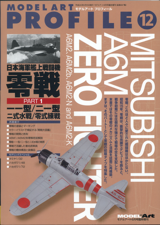
Model Art #847 Mitsubishi A6M Zero Fighter Monograph Pt 1


The latest aircraft type monograph from Model Art is about the Mitsubishi A6M Zero Fighter and is Part 1 of, presumably, a two-part coverage starting with the A6M2, Rufe and two seat A6M2-K trainer. This contains 9 pages of colour detail paintings of various aspects of the A6M previously featured as a part series in the Model Art magazine - a useful collection for anyone planning a large scale build - or even an ultra-detailed small scale build! This is followed by a chapter on colours and markings giving very thorough stencil detail and 17 pages of colour profiles, four per page, in the 'flat' style many prefer. There is a detailed analysis of development with many drawings, plans and photographs, followed by an operations history, a photo register of Zero aces, and a gallery of photos, most of which are well known but reproduced here to a useful size and quality not usually seen. Finally a modelling guide in colour covering the Tamiya 1/32nd, Hasegawa 1/48th and Hasegawa 1/72nd kits. The text is mainly in Japanese but a potted English language summary of the colours and markings chapter and profiles is included and full marks to Model Art for doing this.

The colours and markings section, by Shigeru Nohara, has a presentation of printed colour chips which are quite accurately rendered in a style that looks familiar. The factory paint colour is described and referred to as 'gen-yo ame-iro' (現用飴色 - 'currently used ame colour' where ame means rice jelly or candy - an amber colour), a description taken from the Yokosuka Kaigun Kokutai (KuGiSho) Report No.0266 of March 1942:-

"The Type Zero or the A6M fighter, developed as a successor to the Type 96, had an anti-corrosion finish made on the production line. Its paint finish consisted of a layer of red-oxidised (sic) primer paint on the alloy construction base surface which was covered with a benzyl-cellulose based metal paint in what could be expressed as "grey-green-bistre" as a top coat."

So far so good and I can detect some grey-green hearts a leaping at this. But soft, what light from yonder window breaks? The unusual term "bistre" is said to mean a dark grayish brown, with a yellowish cast. Mr Nohara goes on to explain:-

"Immediately after application, it had a glossy appearance and more or less looked like an old-fashioned Japanese starch syrup (mizu-ame). Strangely this color was not listed in the Standard for Naval Paint nor been given a color code and/or official name, and the name and code are still unknown today. In an experiment held between November 1941 and February of the next year in order to develop effective aircraft camouflages on the Type Zero fighter, this "grey-green-bistre" color was referred to ambiguously as "gen-yo-ame-iro"."

Well, not quite. Before the repeated and abbreviated description the paint colour was first described as J3 (Hai-iro ash or gray colour) leaning slightly toward amber colour (Ame-iro - caramel or candy colour)". But the thrust of the description is correct and concludes that:-

"The shade (hue) of the "gen-yo-ame-iro" is close to FS 14201 (gloss) or FS 24201 (semi-gloss) as in the American FS595b color standard."

So all's well that ends well. But then, remarkably, the modelling guides go off at a tangent and describe the colour as that old impostor grey-green - as in 灰緑色 (hai-ryoku-shoku - ash green colour). Isami Akiyama paints his 1/48th Hasegawa Zero model in Mr Color 315 which is semi-gloss FS 16440. This colour is pale and de-saturated when compared to the Zero paint colour with a difference calculation of over 11 where less than 2.0 = a close match. It is paler than even the most extreme colour value on the degradation model with a difference to that of 6.23. The pigments are quite different too. FS 16440 is probably most familiar to modellers by being regularly cited to match USN Light Gull Grey - and that is another story - but make of that what you will. The light grey Zero dies hard!


The closest colours with which to visualise the original Zero factory paint colour in available modern standards are FS 16350 in FS595b (fair), C27-60D (Munsell 7.5 Y 6/2) in JPMA (better) and RAL 7034 (best), the latter being designated, unsurprisingly, as Gelbgrau - yellow grey. The grey colour as shown on the cover of the Model Art book, on the models in the modelling guide and on the modelling guide profiles is only suitable to represent a long exposed, oxidised and heavily chalked paint surface (and probably goes too far if an operational aircraft is to be represented), in which case it should be depicted as dull and weathered rather than glossy and brand Harry spankers! I'm not sure why the editorial staff let this dichotomy go in the book because it is guaranteed to cause some head scratching.

Generally, this title will be useful to the modeller planning to build the Zero, concentrating as it does much useful material and visual guidance into one handy book, and is unhesitatingly recommended. The price of ¥2381 (about £19) is actually good value considering the very concentrated and full content.

(★★★★☆)


Image credit: Book cover © 2012 Model Art Co. Ltd; Rendered colour chips © 2012 'Straggler' 


Monday, 9 November 2009

Nakajima J1N1-S "Gekko" (Irving) Colours


An interesting question at Hyperscale provided food for thought about the colours of the Imperial Japanese Navy's Nakajima J1N "Irving" in its various incarnations. It is easy to perceive the IJN colour schemes as "boring", plain dark green over grey, especially if one resorts to standard hobby paints like Tamiya IJN Green and IJN Grey. But explore a little deeper and there is a rather richer seam to be mined.

The question was primarily about the undersurface (and also the interior, of which more anon), where several references suggest light grey paint. Chris Cowx, however, made a very interesting observation based on first hand examination of wreckage, which sent me off in a perusal of the scant photographic evidence. The observation is too significant to become lost in the Hyperscale clutter so I hope that Chris won't mind me quoting it here for posterity and for the benefit of the dedicated Japanese aircraft community:-

"I have spent a bit of time doing some wreck hunting in the south pacific and have seen an early Irving from the exact unit and time frame in question. The 60+ years of weathering has of course removed most of the paint, however the undersides seem to be in NMF. There is red oxide primer remaining and it seems to have been sprayed freehand over the upper surfaces with no discernable paint below. You can see where the primer ends in a soft demarcation and there is no trace of it below that. Comparing it to other wrecks that are known to be NMF beneath shows a similar pattern of remaining paint. It would be a fair assumption that if there was no primer on the undersides then there would have been no paint."

Now it can be very difficult to determine light grey paint from oxidised natural metal in photographs, but in this case the photographs studied suggest that they were indeed unpainted natural metal. These two pieces of complementary and corroborative evidence beg the question what did the various published references use as a basis for presenting the undersurfaces as light grey?

Mr Mikesh identified the original external paint on the NASM J1N1-S Irving s/n 7337 as Thorpe's N2, equivalent to Munsell 10 G 3/2. At first this appears counter-intuitive. Surely on a nightfighting aircraft the black green of N1 would be more appropriate? Then one considers the characteristics of NIVO (Night Invisible Varnish, Orfordness), a dark grey-green, and the RAF experience to summise perhaps that the Imperial Navy were discovering for themselves that the most effective night camouflage paints were lighter.

But it is more complex than this. In his examination of Japanese aircraft colours at NASM in the Asahi Journal Vol.3 No.1, Mr Mikesh measured the surviving extant paint traces on s/n 7337 as being to a Munsell value of 1.9G 3.0/0.7, which he equated to the closest Munsell standard value of 10 G 3/2. How this conclusion was drawn is unclear because as may be seen from the analysis here the measured value is actually slightly closer to N1 and closer to the value of 2.5 G 3.0/0.5 - a green so dark and with so little green chroma that it is almost a dark grey, as the close comparison to FS 25081 reveals. Was this a dull and faded N1 or N2 with much of its green chroma robbed by time and temperature?

It is always tempting, in the absence of other evidence, to assume a continuous standard provided by a single extant example. This is not entirely foolproof, because aircraft production painting is rarely an undeviating continuum but instead usually reflects a series of modifications to answer changing logistical or operational needs. We need go no further to find a striking anomaly than Gallagher's 'Meatballs and Dead Birds', where an abandoned 'Gekko'at Atsugi, tail code 'YoD-172' is described as having been painted in a "shade of green unlike any other at Atsugi", a green compared to the colour of the seal on the front of a dollar bill. Courtesy of a valued correspondent in the USA suggested matches for the green in FS 595b are 14090, reported as slightly too intense, 14120 which has a slight grey caste and 14115, the closest although lacking yellow. Of course these can only be approximations but the colours are included to give an impression of how bright this green may have appeared. That such bright greens existed in the paint colour standards is confirmed by the extant Kariki 117 'D' series swatches shown here, including Ryôichi Watanabe's suggested FS 595b comparisons as reported in Arawasi magazine Issue 9, Apr-Jun 2008.

Early Irvings at Rabaul look very dark, almost black in photographs, and with all the usual caveats about the dangers of interpreting b/w photographs it may be that they were painted in the equivalent of N1 on the upper surfaces only, before being shipped south. The irony here is the possibility of the exact opposite of what we once believed, that in reality these aircraft undertook their first operations in a very dark, almost black green and finished up as nightfighters wearing much lighter greens.

However the authors of the modeler's eye series monograph on the Gekko draw an opposite conclusion, reporting that the earlier aircraft appeared to be a much lighter green, "believed to be the result of in-field painting of unfinished (silver) aircraft without proper priming, resulting in the lighter appearance." That conclusion is difficult to draw from the photographs studied and the description of the colour schemes is somewhat ambiguous in its reference to the "all dark green scheme". The book is mainly a vehicle for building the Tamiya 1/48th kit and the colour information is confined to a generic description "dark green" and the citing of Tamiya paint AS-1/XF-11 'Dark Green' which appears to be more like N2.

The Fujimi Irving kit instructions suggest a "Blak Green" (sic) equivalent to FS 34077, achieved by mixing 80% H59/15 (IJN Dark Green Nakajima) and 20% H12/33 (Black) but make no distinction between the colours of early and later models. This FS value is closer to N1 than N2 (3.53 to 6.52 where >2.0 = a close match), but as may be seen the Munsell value for N1 is greener and richer than the FS value suggested. The closest Munsell value to 34077 is 7.5 GY 2/2 @ 3.5o but it is only a smidgeon ahead of 10 GY 2/2 (N1) @ 3.53. The closest FS value to N1, and it is very close at 1.10, is 14056. This value is also close to Munsell 7.5 GY 2/2 @ 2.08. If you have followed thus far and not yet fallen asleep the reasonable conclusion is that Fujimi are suggesting the black-green N1 as the colour of Irving.

K Koizumi's painting of the early production J1N1-S '02-03' of the 202nd Ku in FAOW 57 depicts a green resembling N2 rather than N1, but it is a more yellowish - or cadmium - green of a similar hue to that seen on the Zero in the Atsugi colour film. The profiles show two different greens, with a lighter more viridian colour for the early production examples with unpainted/grey undersurfaces and a colour slightly more towards an olive green for the overall green painted aircraft. Both could be said to be approximations of N2 rather than N1 but the actual dark green is not referenced to Kariki 117.

In Model Art 272 translator Dr Widman Livenow describes the Irving colour scheme as"deep green-black with lower surfaces in ame-iro(sic)" suggesting N1 rather than N2.

Interior Colours

The original interior colours of the NASM example have been documented as being partly finished in the exterior colour N2 and partly in 'aotake', the blue-green translucent protective coating that results in a "metallic" appearance to the paint surface. Again, in the absence of data for earlier machines it is tempting to take this as typical and use it as a guide for all Irvings. However, the finish has all the hallmarks of late-war expediency, in the partial painting and use of external paint colour, so it may not be the most appropriate choice for earlier aircraft.

As a Nakajima aircraft it is possible that the interiors of earlier aircraft reflected paint colours similar to those found on Nakajima-built Zero aircraft.

A continuation of this article will explore detail colours and the relevant hobby paints.

'Straggler'

References

1. Hyperscale "Plane Talking" post on October 17 2009 at 9.12 p.m: "Alright, don't y'all freak out . . . "
2. 'Moonlight Interceptor - Japan's "Irving" Night Fighter', Robert C Mikesh and Osamu Tagaya, Smithsonian Institution Press, 1985
3. 'Japanese Aircraft colors at NASM', Robert C Mikesh, Asahi Journal, Vol.3 No.1
4. 'Japanese Aircraft Interiors 1940-1945', Rober C Mikesh, Monogram Aviation Publications, 2000
5. 'Imperial Japanese Naval Air Force Fighter Camouflage and Markings, Model Art 272 and translated English summary edition by Dr Widman Livenow, Aviation Usk, 1996
6. 'Navy Night Fighter "Gekko"', FAOW 57, 1996
7. 'Nakajima Night Fighter Gekko Type 11 Late Production (Irving)', modeler's eye series # 1, Dainippon Kaiga, 2001
8. 'Meatballs and Dead Birds', James P Gallagher, Stackpole Books, 2004
9. 'True Colours: Kariki 117', Watanabe Ryôichi, Arawasi Magazine Issue 9, 2008
10. 'A History of the IJN's Night-Fighter Units', Yoji Watanabe, Dainippon Kaiga, 1993
11. 'San Maru Futa 302', Koku-Fan Illustrated #96, Bunrin-do, 1997
12. 'Nihon Rikukaigun Yakan Sentôki' (Japan's Army and Navy Night Fighter Aircraft), Model Art 595, 2001
13. 'Japanese Military Aircraft Illustrated' Vol.1 Fighters, Koku-Fan Illustrated Special, Bunrindo, 1982
14. 'Heroes of the Omperial Japanese Navy Air Force in 1937-1945', Model Art 439, 1994

Image credits: Artwork ©2009 Shigeo Koike; Rendered colour chips ©2009 Straggler

Sunday, 22 August 2010

Golden Claude & Updates


The release of Special Hobby's 1/32nd A5M has rekindled interest in the "golden" finish of this iconic type. One of the best representations I have ever seen is Tom Cleaver's superb model, featured at the Modelling Madness website. To my mind it captures perfectly the anodised "Bento-box" appearance remembered by some eyewitnesses. My thanks to Tom Cleaver and Modelling Madness for kindly giving permission to show and link to it here.

Whether this finish was the result of a clear varnish applied over the natural metal or of using anodised aluminium in construction (or both) remains unconfirmed. In the USA the National Bureau of Standards had begun an investigation into the corrosion of light metal alloys used in aircraft as early as 1925 and this included various coated and uncoated surfaces, as well as the application of paints. During the 1930's the subject was explored in the UK and Germany with particular interest in aluminium pigmented paint coatings. A 1938 National Bureau of Standards report by Willard Mutchler (NACA No.633) concluded that the use of surface treated alloys together with aluminium-pigmented paint offered adequate protection in maritime conditions, provided the materials were not subject to frequent immersion.

In the UK around the same time Cellon had produced a grey primer paint with zinc oxide and yellow oxide combination additives which was found to be more effective than alumium-pigmented paints in resisting maritime corrosion. This grey paint was subsequently marketed as "Cerrux Grey". In Germany similar developments in coating protection were being explored with the introduction of corrosion-resistant grey paints in place of earlier alumium-pigmented paints. Germany had sold several aircraft types to Japan in the late 1930's and it is inconceivable that these protective coating developments had not been communicated within the proprietory or technical literature accompanying these exports.

Anodising had first been used on an industrial scale in 1923 to protect Duralumin seaplane parts from corrosion. This early chromic acid process was called the Bengough-Stuart process and was documented in British defence specification DEF STAN 03-24/3. Oxalic acid anodizing was first patented in Japan in 1923 so the process was known to the Japanese. It may have been considered an appropriate means of protecting aircraft in maritime environments where full immersion was not expected (as with carrier based aircraft). It is not unreasonable to expect that there may have been a certain amount of experimentation in developing corrosion-resistant finishes and coatings once this all-metal type entered service, so where we expect a single finish there may have been several throughout the service life of the type, including ultimately painting with the "special grey paint for light metals". 

The aspect of anodising that may be of interest in respect of Claude is that it can produce yellowish integral colours without dyes. Shades of colour can be in a range which includes pale yellow, gold, deep bronze, brown, grey, and black. Some advanced variations can produce a white coating with 80% reflectivity. The shade of colour produced is sensitive to variations in the metallurgy of the underlying alloy and cannot be reproduced consistently. Therefore where one looks in vain for signs of a transparent coating in photographs of the natural metal finish A5M this does not necessarily mean that the aircraft in question was not "yellowish" (or "gold") in appearance. Some modellers may agonise over interpreting or choosing a finish but my advice would be not to sweat it and if you prefer a straightforward natural metal then go for it.

Japanese Aircraft Interiors by Robert C Mikesh

I was astonished to read some particularly dismissive comments about this important work of reference at a well-known modelling forum. In addition to citing a lack of information on actual interior colours, one poster stated that he had "read it through and then sold it". Is it a novel?  I cannot imagine trying to retrieve the copious amounts of information in the book without having it to hand. It is a work of reference and in my view indispensable. The main issue with using it is in the various colour standards cited and the occasional inconsistency in matching them.

Another poster commented that as a reference it was "dated". Really? Does this mean that the precise photospectrometric colour measurements from actual aircraft recorded in the book have been superceded? Hmm. Perhaps a blurring of the difference between knowledge and opinion. I encountered this once myself, where Mr Mikesh's measured values (colour values measured from the actual extant paint surface with photospectrometric equipment) were disputed in favour of the appearance of colour photographs and the memory of a museum visit.

Well to get back to Mr Mikesh's "lack of information" here are some facts. The book covers 18 Army types and 28 Navy types, of which precise colour information is given for 11 (61%) and 19 (68%) types respectively. The grand total is precise colour information for 30 (65%) types out of 46. On the shelf within reach, permanent and in the absence of anything else, pretty useful I should say.

RS Models E15K "Norm"

From correspondent Jeff Groves I received these useful comments about the kit .

"I recently finished the Xotic-72 Norm kit, and had issues getting it to sit right on the beaching gear.  If you look at the few pictures of the actual aircraft available, the main wheels of the dolly sit right under the leading edge at the wing.  Despite adding weight to the main float (and even the propeller spinner!), there is just too much plastic aft of the wheels and the plane sits on it's tail.  My solution was to add an extension to the after part of the dolly to place some support aft, as some IJN dollies had this "double ended" configuration.

As seen in the screen shots, RS have provided a dolly which is designed to sit too far aft.  The rear support rests aft of the step on the main float on the model, it was actually just forward of the step.  Correcting this is not simply a matter of scooting the model back - the support heights are different, plus the model will sit on it's tail when the dolly is properly positioned.  The dolly alignment markings on the box art match the prototypes, but the dolly provided will not match these.  Without some change, the finished model will have the glaring error of the dolly markings on the float not lining up with the dolly.

Models should decide on an acceptable correction before beginning this build."

Thank you for this!

Computer Woes

Please bear with me. I have been experiencing some pretty horrendous problems recently which make connection difficult and unpredictable. Normal service will, I hope, be resumed soon!

Image Credits: Special Hobby A5M2b by Tom Cleaver via Modelling Madness, with permissions.


Saturday, 22 June 2024

Kariki 117 Colour I3 and 8609 Colour 3-3 Tsuchi iro


The colour I3 from the Tsuchi iro (Earth or clay) colour set on Kariki 117 was once mooted as both the Zero colour and the colour of Pearl Harbour era B5N2 'Kates' (97 Shiki Kanjo Kogeki-ki 九七式艦上攻撃機  or 97 KanKo - 九七艦攻). The late David Aiken described the 'Kate' colour as 'Grey Poupon', alluding to the appearance of French mustard, but it was also described as 'khaki'. The degree of grey, green or yellowishness perceived in the colour has varied according to different visual comparisons but the 3-3 swatch from the February 1945 8609 colour standard has been deemed identical to the I3 which it directly succeeded. The Japanese Aeronautic Association measured L*a*b* values of the 3-3 swatch are shown below, unsurprisingly 'brown', together with visual comparisons made previously by Japanese researchers. 


The Ryôichi Watanabe comparison to FS 20318 seems anomalous and he described Kariki 117's I3 somewhat enigmatically in an article in Arawasi magazine (Issue 9, Apr-Jun 2008) as 'used as a second coat on Zero fighters and other aircraft, but there are several people who wrongly believe that I3 is ameiro (a light brown or amber colour)'. Did he mean a second coat as between the red oxide primer and 'grey' topcoat or as the topcoat itself?  The comparison to FS 34201 by Owaki-san takes us into Zero 'olive grey' territory.  

The question of natural metal finish (nmf) under surfaces on some Pearl Harbor 'Kates' has run long and in its 1/48 scale kits Hasegawa has variously depicted grey green or 'silver'. The late Jim Lansdale was of the opinion that the finish varied as the result of production chronology and that he had examined KanKo artefacts where the dark green was painted over nmf and others where it was painted over the 'olive grey' finish. He estimated that the last 200-300 KanKo produced by Nakajima up to August 1941 were probably in a factory applied overall olive grey scheme, implying that older aircraft already in service may have been camouflaged dark green on upper surfaces but retained nmf under surfaces. His extant sample of metal from the so-called 'Hospital Kate' did not have any primer and he had seen no evidence of any primer on the olive grey painted aircraft. Does that imply that they were possibly IJN Depot rather than factory painted after the olive grey paint was adopted for the Zero? In any event the olive grey appears to have been the warmer. more yellowish Nakajima colour. It was possibly patches of that paint showing through the dark green camouflage paint that gave rise to the idea of PH KanKo sporting 'brown' blotches on the green camouflage.  

Fuchida described the Kates as being camouflaged very roughly and hastily in green and brown (茶褐色 chakasshoku) with his own aircraft remaining 'bright' underneath, which is a little ambiguous but might suggest the aircraft was unpainted prior to camouflaging and that the under surface retained a natural metal finish. The problem with Japanese descriptions of 'brown' has been discussed before but chakasshoku appears to cover colours from dark reddish brown to yellowish brown or tawny.  The box art on the Nichimo Kate was based on his description but depicts a very dark brown. FWIW the paint on the 'Hospital' Kate is a slightly variegated Munsell 7.5 Y 5-6/2 which puts it into that familiar slightly lighter than FS 34201/16350 territory. Therefore the difference between I3 and the Zero-type olive grey is probably unimportant. One detail that is easily overlooked is that the amber/olive-grey paint was glossy whilst the dark green camouflage was duller or flat. 

A fabric sample from the 'Southeast Loch Kanko' had a layer of red oxide, a layer of aluminium and a top coating of olive grey. A piece of the rudder fabric had bright red over the olive grey layer. Jim Lansdale noted that according to Bob Mikesh the under surface fabric of a B5N amongst the approximate 50 manufactured by No. 11 Kokusho during 1939-40 was doped a blue-grey colour approximating Munsell 5 PB 6/1. That would be approximate to FS 36320, so possibly not the more neutral, dove grey of J3.  The pigments in 36320 as might be expected for a low saturated 'purple blue'  are rutile (non chalking) titanium dioxide (white), green shade phthalo blue, quinacridone red and blue shade carbon black. But in addition to the manufactured aircraft the No.11 Kokusho may have reconditioned or modified many B5N airframes from 1942 until March 1944 applying an unknown variety of paints. The B5N was also manufactured by Aichi from June 1942 to September 1943 with a run of approximately 200. Probably one of the most common pitfalls for modellers is to assume that extant paint examples from one aircraft represent all the others unvaryingly. Generally speaking Japanese modellers are much more relaxed and pragmatic about this.

The heading photo is from film footage of a Midway-era KanKo taking off and the lighter outer wings are intriguing. Is the lighter colour on this bird olive grey (or 'grey poupon'!) and was the darker green (?) camouflage applied on board the carrier with the wings folded?

Make of it what you will . . . 

Image credit: B5N photo web; Colour schematic © 2024 Aviation of Japan

Tuesday, 20 April 2021

Rex from Rising


Appropriate to the continuing IJN floatplanes theme this recent release from Rising Decals, one of four new decal sheets, features Kyofu with three markings options in 1/72 scale for the Hasegawa kit.  All are early production versions, as follows:-

  • A1-105 of 936 Ku in the East Indies in 1945 as seen in the Kyofus at Surabaya featured here in February 2020  
  • YoG-101 s/n 514 said to be of 903 Ku at Tateyama in 1945 and currently in store at the NASM
  • 951-12 of 951 Ku, Sasebo detachment, at Sasebo in September 1945


There seems to have been some mix up in the wording of captions on this sheet between the second and third subjects. All the subjects are in dark green over grey schemes with YoG-101 distinguished by a red spinner. Hinomaru sufficient for one aircraft are included and warning bands/stripes will need to be provided from the kit decals or by the modeller. The sheet is well printed with the correct orange yellow hue for the tail codes rather than the lemon yellow printed on some decal sheets. 


The surviving post-war Rex was stripped of paint and re-painted with USN blue paint, perhaps giving rise to a long running perception of a distinctly blueish green applied by Kawanishi. In fact when Robert C Mikesh* examined the original paint on the NASM example (protected by the tailplane fillet) he found it equated to Munsell 3.2 G 3.0/0.9, nearest 'standard' Munsell 5 G 3/1,  or to Thorpe's N2 Dark Green. Likewise when the extant Emily flying boat was restored in Japan the original paint was found to be the standard IJN black green.


Thorpe's N2 is Munsell 10 G 3/2 but the closest FS 595 value is 34058 at 3.99, significantly more blueish and perhaps inspiring the brighter blue-green attributed as 'Kawanishi Green' in several hobby paint ranges. The colour values cited by Mikesh suggest the paint on Rex was applied to the IJN D2 standard. Further details of Rex colours with chips to be published here in due course. Rising suggest a mix of 90% Gunze 124 Dark Green Mitsubishi with 10% 65 Bright Blue which reflects the Hasegawa kit instructions for 'Kawanishi Green', together with Gunze 35 IJN Gray (Mitsubishi) for the under surfaces. Mikesh found the original grey paint preserved on the masked-off data plate matched Munsell 7.2 YR 5.4/1.1 (a light greyish brown) but thought the thinly applied grey might have been influenced by the red-brown primer layer beneath it. Even so all indications are that the under surface paint was a warm amber grey rather than the cooler, brighter, whiteish light grey so long attributed in Japanese instruction sheets. This paint typically chalked to a lighter, slightly blueish grey in service, so all is not lost!    

With special thanks to Rising Decals for the review sheet, recommended as an alternative and improvement to the kit sheets.   

* In 'Japanese Aircraft Colours at NASM', Asahi Journal Vol.3 No.1 (undated)  

Image credit: All © 2021 Rising Decals     

Wednesday, 15 March 2023

Grey Blue Cockpit Interior in Ki-61


Hat tip to Lorenzo of Italy for kindly alerting to this interesting Japanese video footage clearly showing the grey-blue # 3 Ash Indigo colour (Hai Ran shoku - 灰藍色) in the interior of a Kawasaki Ki-61 Hien 'Tony' recovered to Japan from New Guinea. The colour is similar to FS 36118 Gunship Gray, ANA 603.

From 1936 the grey-blue paint was to be applied as an overall primer to replace aotake, sometimes with the addition of # 17 Faint Blue colour (Tan Sei shoku - 淡青色)  as a middle coat before the grey green # 1 Ash Green colour (Hai Ryoku shoku - 灰緑色) was applied to external surfaces in top coats, sanded and polished. The whole interior, including the cockpit, was to be painted the grey blue colour and this was introduced with the Ki-15, Ki-21 and Ki-27. In practice this continued for the cockpit into the war years, certainly for early production Ki-61, whereas aotake continued to be applied to other parts of the interior. When the application of aotake to interior surfaces was discontinued in early 1943 in order to to speed production cockpits began to be painted in other colours in a more haphazard manner, including the # 1 grey green and another darker grey green paint similar to that used for Hayate propellers.     


The grey blue paint was also found inside the wing sections of the hybrid remains of Ki-61-I Ko/Otsu c/n 379/640 (379 constructed in Sep 1943 and 640 in Nov 1943), although the wheel wells appeared to be painted in a lighter grey colour, unspecified. Whether the lighter grey paint was very badly degraded, chalked or faded grey blue is now impossible to say. The problem, as referenced before, is that restorers take an inconsistent approach to measuring and recording extant paint in surviving airframes, often just stating that new paint 'matches the original' without actual providing colour values for it, the original paint being destroyed in the process. And laying standard paint swatches against the original paint surface and photographing them is not a valid scientific method for identifying the original colour value(s). 

Update

Added some additional details of painting technique for the 11 March 2023 blog post featuring Guillermo's Fine Molds Ki-43-III Ko .